top of page
Julian Howland
Mello
Illustrator, Photoshop (2024)


The typeface that this logo was created from is “Fit” by David Johnathan Ross. Ross describes it as “a hyper-stylized series of caps designed with one thing in mind: filling up space with maximum impact.” This perfectly matched my vision of this brand. I aimed to create a logo that felt cozy, keeping the shape of a blanket in mind. The font used throughout the advertisements is Montserrat.

RIT Typography 2 Project. Creating our own concept brand identity with branding personality. Starting from a logo and ending up with mockups.


Mello is a blanket company focused on weighted blankets. The design of the logo is inspired by 60s and 70s psychedelic typography. I researched various type and posters from that era and created a modern, minimalistic rendition. Following the psychedelic direction, Mello focuses on patterns across the branding.


The colors I chose were, like the logo, inspired by the 60s and 70s psychedelic designs. They used vibrant colors like pink, purple, and blue. I chose pastel versions of these colors to better fit the relaxing feeling of Mello.

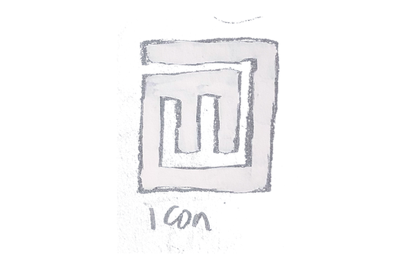
I did lots of research on psychadelic typefaces and typography. I also looked at how these typefaces were used in posters and logos from that era. This research inspired the logo I ended up with because of the tight fit lettering, bold type, and connecting letters.


bottom of page